Spot The Difference
Here’s Google Chrome on Fedora:

Here’s Firefox with a “Google Chrome theme” on Fedora:

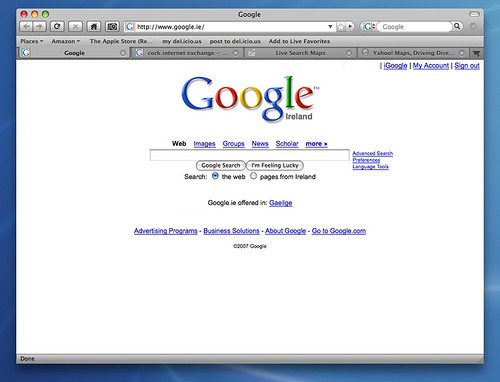
What’s the WTF-were-you-thinking mistake? Can’t figure it out? How about if I tell you it also applies to the default Firefox theme on OSX:

But not in the default theme for Windows:

Or Ubuntu:

Still can’t see? How about an analogy:
Still don’t understand? Let me spell it out:
Chrome gets this (as does Opera, but I don’t give a shit because their browser is still proprietary), but this supposedly-Chrome theme (as well as the OSX theme) have made the bad UI of Firefox EVEN WORSE. The default Windows and Gnome themes have tabbed pages, with some unknown, magical force changing the address bar when switching tabs. This is BAD since it requires either reverse-engineering, or study of the code, to find out the behaviour. However, with those ‘upside-down’ tab themes the tabs are now controlling the address bar, with an unknown, magical force changing the page content accordingly. This is EVEN WORSE since it is the page contents that people actually care about! Hype Firefox all you want, but I prefer looking at Web SITES to looking at Web BROWSERS.
In short: EPIC FAIL